

Challenge From our initial research and discovery it was clear that the Better Than Bouillon website required more than a pretty design update. Many consumers did not have a full understanding of what the product was, how to use it or where to find it.
Solution Understanding the need for education on several levels, we set three basic goals for the website that helped guide our decision-making from navigation to content to layout. Then our UI (User Interface) team developed an entirely different look and feel, designed to offer a range of both visual and functional improvements.
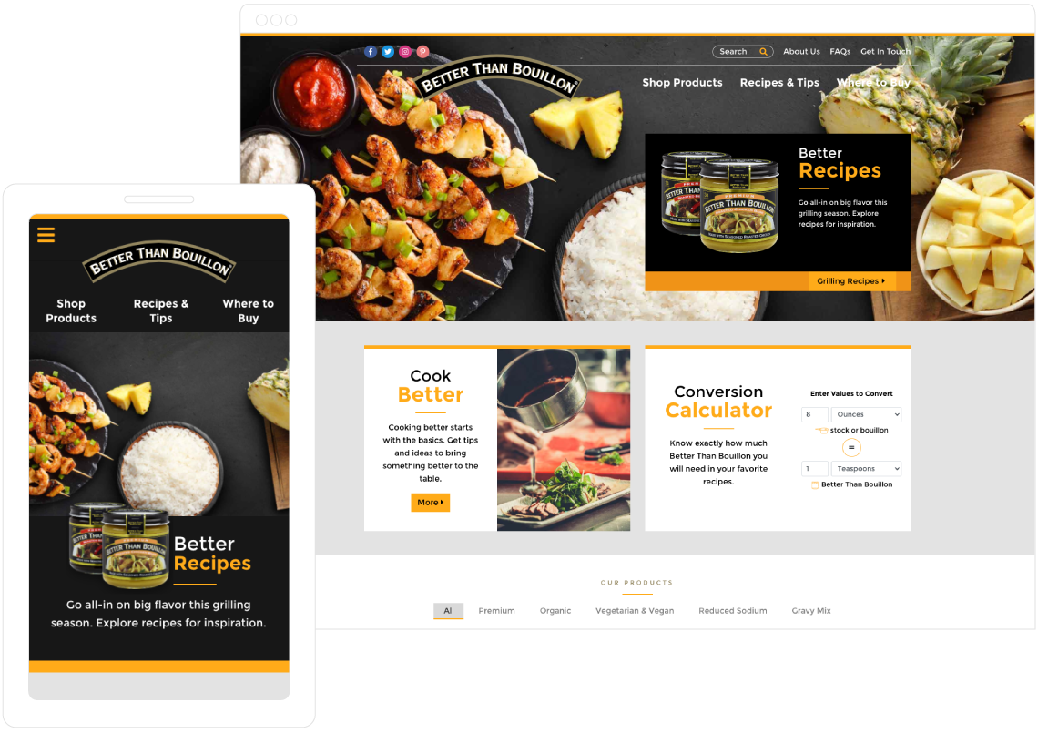
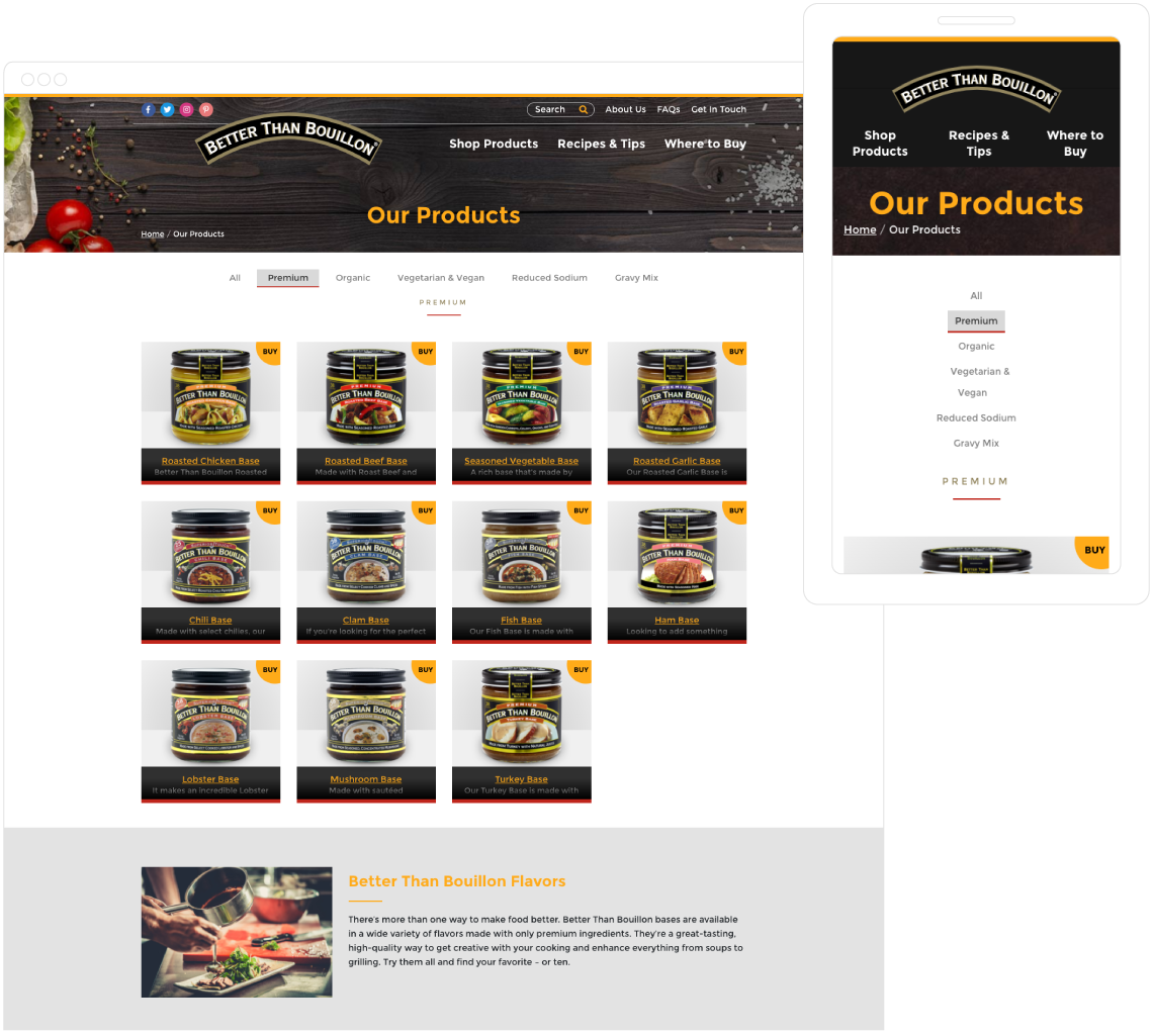
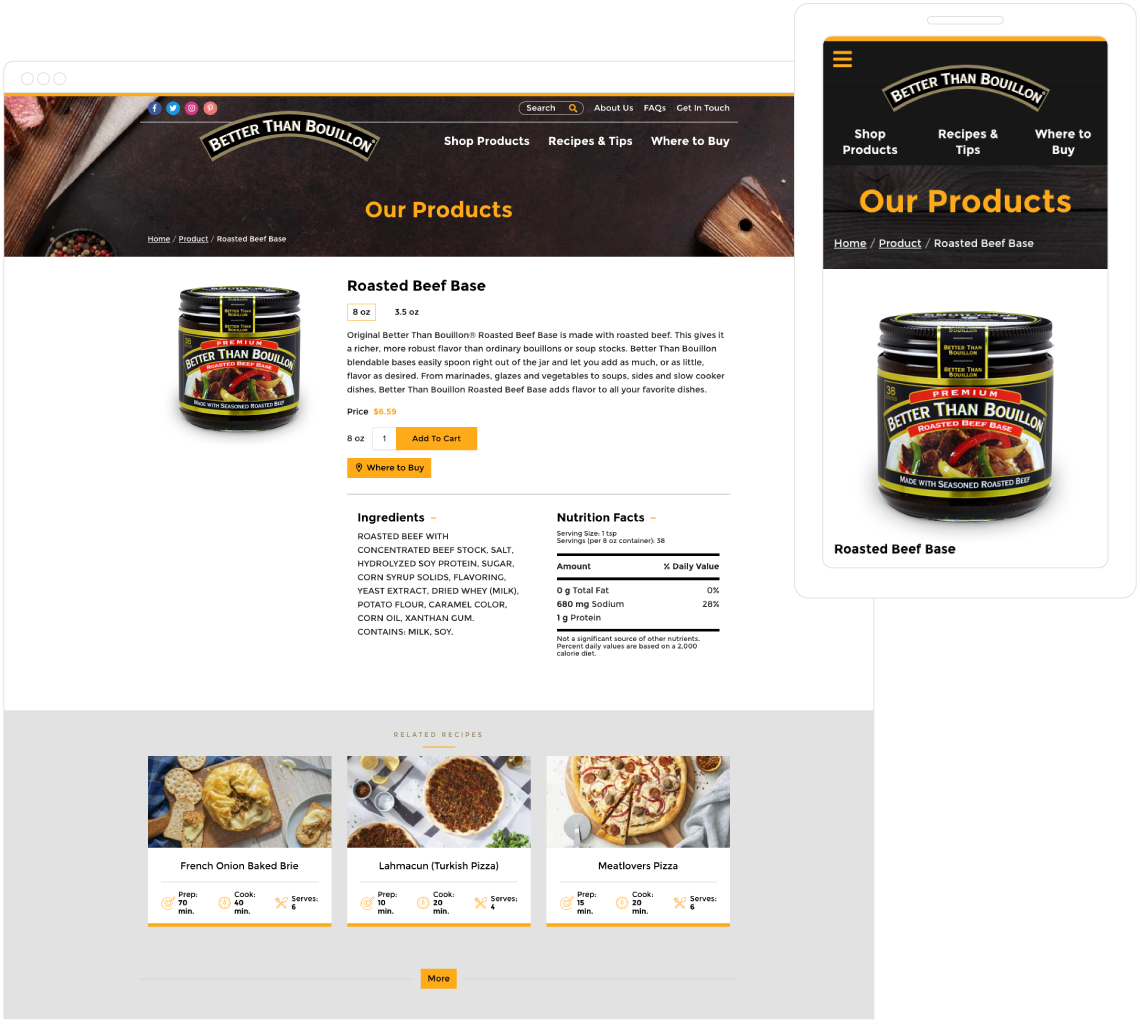
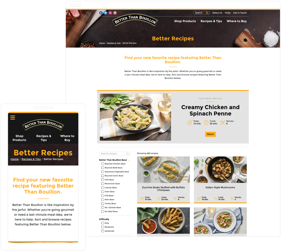
We launched the new BetterThanBouillon.com as user-first site that covered everything from product tips and recipes to conversion calculators to product locators and even the integration of a new e-commerce platform. The site has helped drive Better Than Bouillon’s momentum as a leader in a rapidly-growing category. Additionally, the site went on to serve as a template for other brands under the same parent company as Better Than Bouillon, which PHG also executed.